

Deep Learning
What is Tensorflow? How to Set up Artificial Neural Network Model with Tensorflow?
What are Artificial Neural Networks and What is Tensorflow?
Artificial neural networks are deep learning algorithms that have the same working principle as neurons. Artificial neural networks; It consists of cells that receive data, transform it and, if conditions are met, forward it to the next stage. These cells are located in layers within artificial neural networks. While each layer has a specific task, the common purpose of these layers is to evaluate the incoming data and contribute to the learning phase with the gains obtained.
What is Deep Learning?
We learned that Artificial Neural Networks are a deep learning algorithm. So what is deep learning? Deep learning is an advanced machine learning technique with a layered structure. With the developments in computer technologies, there have been significant developments in deep learning algorithms that can perform more advanced operations. The best example of deep learning algorithms is, of course, artificial neural networks.
What is Tensorflow?
Tensorflow is a large open source library that includes many libraries for machine learning and deep learning. Tensorflow, created and developed by Google, is frequently preferred in many deep learning projects. Tensorflow also provides great convenience in projects with artificial neural networks, thanks to its many libraries. Let's get started then!
How to install tensorflow?
To install tensorflow with pip package installer, simply run the following command in the terminal.
pip install tensorflow
To install tensorflow with conda package installer in Anaconda, simply run the following command in the terminal.
pip install conda
How to Build an Artificial Neural Networks Model with Tensorflow?
We will try to build an Artificial neural network model using the Tensorflow library. We will do this study with the iris data set, which is a very important data set for data analysis. In the data set, our target column is divided into three: "Iris-setosa", "Iris-versicolor" and "Iris-virginica". We will establish an algorithm that will accurately predict the type of data we have. I will explain the general structure of the study and the algorithm here. I will also share the entire code for those who want to examine it in detail. Let's start.
Let's get to know the data set. What is Iris dataset?
Iris data set is a flower data set consisting of 5 columns (excluding the Id column). The Species column is the target column that we try to guess and consists of the names of the species of the flower. It tries to find the species in this column with the other 4 columns. So what are the other 4 columns? These 4 columns contain sepal-length (lower leaf length cm), sepal-with (lower leaf width cm), pedal-length (upper leaf width cm), pedal-width (upper leaf length cm) data. It is information about the leaf dimensions of the flower.
Let's try to understand the statistics of the dataset and visualize the data.
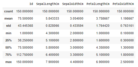
There are a lot of numbers, what should we understand from them? These data are the basic statistics that describe the data set. It contains data such as the number of data and column averages, standard deviations, min-max values. Many meanings can be derived from these data, but my purpose in putting them here is to draw attention to a point. While the data in the 1st column is distributed in the range of 5.843-7.900, the 4th column is distributed in the range of 1.199-2.50. We can say what's wrong with this. However, some distance metrics and some algorithms are greatly affected by this difference. Since distributions in these different ranges can disrupt the algorithm structure, the data set should be standardized and ease of use between columns should be provided. So how do we do this? I will explain this in more detail while setting up the algorithm. Let's continue!
We check whether there is missing data in the data set. The code in the first line in the picture shows how many missing data are in the columns (iris_dataset is the variable name to which we assign the data set).
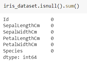
Very good! There is no missing data, we can continue to recognize the dataset. Let's see how many of each type are in the target column.
|
|
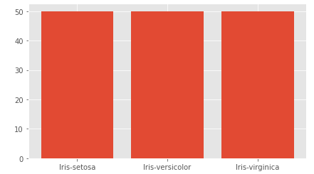
value_counts() method allowed us to access the numbers. It can be seen that the data is evenly distributed.
|
|
Scatterplot is a plot that visualizes the position of data relative to each other. We added another dimension to the graph through hue, in other words, we colored this distribution according to the species in the Species column. Let's look at the output and interpret it.

As can be seen from the graph, PetalLenght and PetalWidth properties significantly affect the type of flower. In the lower left corner, where PetalLenght and PetalWidth measurements have small values, the probability of the flower species being Iris-setosa increases, while in the upper right corner, where these measurement values are large, the probability of the flower species being Iris-virginica increases. Of course, this distribution alone is not sufficient.

The scatter chart of Sepalidth and SepalLength columns is as above. Although there are not as clear groupings as in the previous graph, it is clearly evident that the Iris-setosa species are grouped in the upper left corner.
Finally, let's examine the box plot.
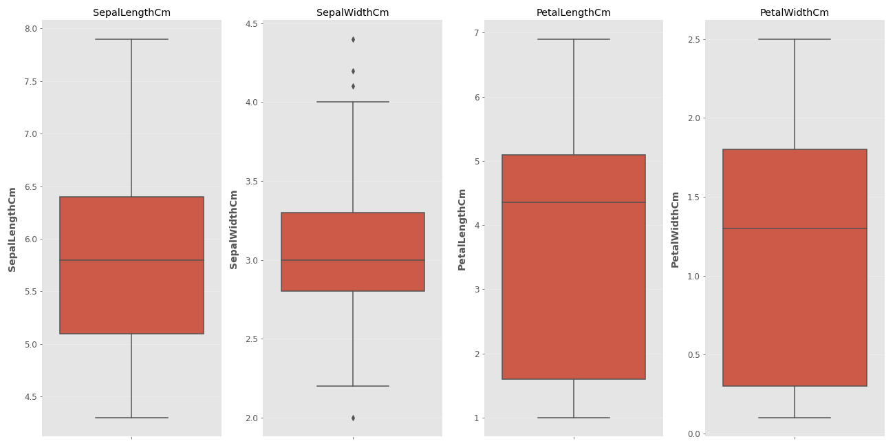
What is a Box Plot and What Does It Do?
A box plot is a data visualization tool that allows us to understand the distribution of data and helps us distinguish exceptional data. So how do we interpret these graphs? The horizontal line inside the box represents the median of the data. The upper edge of the red box represents the 3rd quarter (75%) of the data, and the lower edge represents the 1st quarter (25%). Wait, what are the lines that go on and on for a minute? This is the part that indicates to what extent the data outside the box will be considered normal. Data that exceeds the lower and upper limit lines is now referred to as exceptional data. In the second chart, exceptional data is marked with a dot, while there is no exceptional data in the other columns. So how are the lower and upper limit lines determined? We have seen the features of the data set above with the describe method, now it is time to use that data. 1.5 IQR is added to the upper quartile value (75%) and data exceeding this is considered exceptional data. Extremely exceptional data are data exceeding the 3rd quarter value + 3 IQR. A similar operation is performed when finding the lower bound. 1.5 IQR is subtracted from the 1st quartile value and data below this point is called exceptional data. Data below the 1st quartile value - 3 IQR value are called extremely exceptional data. Everything is so confusing, isn't it? Let's go step by step.
First of all, we need to say what IQR is. IQR is the interquartile range.
IQR = Q3 ( 75% ) - Q1 (25%)
It is clear from the dots in the chart that the SepalWidth column contains exceptional data. So what do we do with this exceptional data? Here, the decision is made by the person doing the data analysis. While the data can be discarded directly, the effects of these exceptional data can be reduced by making them equal to the lower and upper quartile values. In this example, I will not make any changes unless the data is extremely exceptional.
Let's find the extreme exceptional limit. For SepalWidthCm, Q3 = 3.3 and Q1 = 2.8. These data are written in the first table.
IQR = 3.3 - 2.8 = 0.5
lower limit = 2.3 - 3 * 0.5 = 0.8
upper limit= 3.3 + 3 * 0.5 = 4.8
Again, from the same table, we can learn that the data in this column is distributed between 2 (min) - 4.4 (max). These values do not exceed the extremely exceptional limit. For this example, I will not clean the exceptional data because they are not overly exceptional, but it would not be wrong to clean or correct them preferably.
It's time to standardize the data and build the model. Some standardization methods are given below. We will not go into the details of these formulas. We will examine how to do it while building the model. Although we do not examine these methods in detail in this study, it is very important to understand the logic of each.

In our study, we will use the standard scaler method.
|
|
What did we do now? We imported the class that will implement the standard scaler formula from the Scikit-learn library. We created a model called scaler with this class. We defined our X variable by removing the target column and gave these values to the scaler model. As a result, our X values came out of the fit_transform function in a standardized way. Since the target column consists of categorical data, we did not standardize it, but we need a change for the target column as well.
We must make this change because our target column is not in a format that the machine can understand. As you remember, there were 3 different categorical data in the target column. We can change their names to 0, 1, 2, but even though the machine can now understand this, this will not be a very efficient method. This is because the machine will not be able to understand how we give these values and will probably consider the data with the label 2 more important than the others. So what do we do then? We will apply the One Hot Encoding method.

What is One Hot Encoding?
It is a method of converting categorical numbers into numbers in matrix. Let's explain this with an example.
| Elma | Armut | Portakal | |
| Elma | 1 | 0 | 0 |
| Armut | 0 | 1 | 0 |
| Portakal | 0 | 0 | 1 |
| Portakal | 0 | 0 | 1 |
| Armut | 0 | 1 | 0 |
| Elma | 1 | 0 | 0 |
| Elma | 1 | 0 | 0 |
We turn the categorical data in the first row into a matrix consisting of 1s and 0s by writing 1 in their respective places. In this way, data that is more meaningful and easier to interpret for the machine emerges. This process is called One Hot Encoding. Let's do this transformation for the Iris data set.
|
|
This time we imported the OneHotEncoder class from the Scikit-learn library. From this class we created an object called "ohe". We transformed the data into a matrix with the "fit_transform" function. Actually, we just wrote the functions and Python did this conversion for us. Now we have a y value with 3 columns consisting of 1's and 0's.
Now it's time to split the data. We will separate the data into training, testing and validation data. While learning takes place with training data, we will control the learning phase with validation data and evaluate the results with test data.
|
|
Scikit-learn kütüphanesinden train_test_split fonksiyonunu aldık. Bu fonksiyon veriyi bölmemize yardımcı olacak. Parametre olarak bölünecek verileri (X, y) verdik. İkinci satırdaki kodla verilerin yüzde 40 ını test verisi olarak aldık fakat bunu tekrar bölüyoruz son satırda ve yarısını doğrulama (valid) verisi haline getiriyoruz. Sonuç olarak eğitim verisinin oranı yüzde 60, test ve doğrulama verilerimizin oranı yüzde 20 oluyor. random_state değeri ile bölünme şekli düzenlenmiş oluyor. Siz de bu parametreye 33 değerini verirseniz sizin verilerinizle benim verilerim aynı şekilde bölünmüş olacak. Bu çalışmalar arasında kontrol kolaylığı sağlıyor.
Verilerimizi de böldük şimdi modeli oluşturma zamanı.
|
|
Keras sequential sayesinde birbirine bağlı katmanların oluşturulması ve veri akışının bu katmanlar üzerinde ilerlemesi sağlanıyor. layers.dense yardımıyla katmanlar tanımlanıyor. Yukarıdaki layers Dense ile başlayan her satır bir katmanı temsil etmektedir. Katmanın içinde kaç sinir hücresi olacağını ve activasyon fonksiyonlarını yazıyoruz. Burada önemli iki nokta var giriş ve çıkış katmanı nöron sayısı kaç olmalı? Tercihen ilk katmanın nöron sayısının input verisinin sütun sayısına eşit olması beklenir. Bu algoritamanın başarısını etkileyecek bir detaydır. Asıl önemli kısım çıktı katmanıdır. Burada 3 nöron yer alıyor çünkü hatırlarsanız veri setimizdeki hedef sütunu 1 ve 0 lardan oluşan 3 sütuna ayırmıştık. Bu sebeple çıktı katmanındaki nöron sayısını 3 olarak belirledik.
Sırada modeli derleme aşaması var.
|
|
"compile" yardımıyla modeli derliyoruz. Optimizasyon algoritmasını loss fonksiyonunu belirliyoruz. Metrik olarak accuracy değerini verdik. Bu opsiyonel bir seçenektir metrics kısmı olmasa da kod çalışacaktır. Burada yeni bir kavramla tanışacağız: Early stopping.
Early Stopping Nedir?
Algoritma için belirli bir epoch sayısı verilir. Algoritmanın kaç tur çalışacağını beşlirtir. Bu değer gereğinden fazla verilmiş olabilir. Makine bir yerden sonra veriyi öğrenmek yerine ezberlemeye başlayacaktır. Makinenin yorumlama gücünü kaybetmemesi için aşırı öğrenme olmaya başlamadan önce durdurulması gerekir. Bu olay early stopping olarak bilinir. Doğrulama verisi burada devreye giriyor. Eğitim verisinde hata ne kadar azalırsa azalsın doğrulama verisinde hata azalmıyorsa artık makina yorumlama gücünü arttıramıyordur ve bu seviyede eğitim sonlandırlır.
|
|
Buradaki monitor parametresinde algoritmanın hangi hatayı takip edeceğini belirtiriz. "patience" ise sabır seviyesidir. "val_loss" değeri kaç iterasyon boyunca iyileştirilemezse öğrenmenin son bulacağını ifade eder. BUrada 20 değerini verdik. Eğere 20 iterasyon boyunca minimum değerden daha düşük bir val_loss değeri oluşmazsa öğrenme sona erer. Bu değer çok büyük ya da çok küçük seçilirse algoritmanın başarısı azalacaktır.
|
|
"fit" yardımıyla makine veriyi öğrenmeye başlar. Bu örnekte veri az olduğu için kullanmasak da batch_size isimli önemli bir parametre vardır. Veri sayısı çok olduğunda tüm verileri aynı anda eğitmek zor olmaktadır. İşte bu aşamada kaç tane verinin aynı anda eğitileceğini batch_size parametresine verdiğimiz değerle belirtiriz. Örneğin buraya 32 değerini verirsek veriler 32 şerli gruplar halinde eğitilir. Bu zamandan tasarruf sağlasa da doğruluk oranında dalgalanmalara sebep olur. Iterasyon sayısı arttıkça bu dalgalanmalar azalır.
Hadi kodu çalıştırıp çıktıya bakalım

Buna benzer bir çıktı aldıysanız her şey yolunda demektir. Görüldüğü gibi epoch olarak 1000 değerini versek bile öğrenme 182. adımda son buldu. Çıktıda eğitim ve doğrulama verileri için loss ve doğruluk dğerleri yer alıyor.
Ve grafiiiiiik ....
|
|
".history.history" ifadesi sayesinde modeldeki loss ve accuracy değerlerine ulaşabiliriz. Hadi grafiğe bakalım.

Mavi çizgi doğrulama verisine ait. Görüldüğü gibi iterasyon arttıkça hem eğitim hem de doğrulama verisi için hata miktarı düşmektedir.
Peki ya early stopping algoritmayı durdurmasaydı ne olacaktı diye soranları duyar gibiyim.

Eğitim hatası gittikçe düşerken işler aslında göründüğü kadar yolunda değil. Sadece eğitim hatasını takip etseydik ve early stopping kullanmasaydık yorumlama yeteneği olmayan çok kötü bir model çıkacaktı ortaya. Teşekkürler early stopping. Sana minnetarız :)
Hadi modeli bir de tahmin verilerimizle çalıştırıp sonucu görelim.
|
|

Bu da ne? Hani 1 ve 0 larla uğraşacaktık nasıl bu hale döndüler? Cevabı çok basit. Buradaki her veri aslında bir olasaılık. Çıktı katmanına aktivasyon fonksiyonu olarak softmax fonksiyonunu verdik. Softmax, sigmoid gibi fonksiyonlar bize olasılık değeri verirler. Peki nasıl seçeceğiz? Satırdaki en büyük olasılığa denk gelen sütuna 1 yazacağız. Bu sayede ihtimali en yüksek olan türü çıktı olarak kabul etmiş olacağız.
|
|
Test verilerinin y değerlerini ve tahmin değerlerimizi biliyoruz haydi karşılaştıralım.
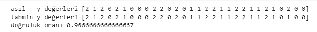
Sadece sondan 3. veriyi yanlış tahmin ettik. 0.9667 temel düzeyde bir analiz için tatmin edici bir sonuç. Makinemiz gayet güzel çalışıyor. Bir kutlamayı haketti :)
Kaynak kod: mustafabayhan/artificial-neural-networks-model-with-tensorflow
Yapay Sinir Ağları teorik kısım : Yapay Sinir Ağları Nedir, Nasıl Çalışırlar?

About author

Mustafa Bayhan
Hi, I'm Mustafa Bayhan. I am an Industrial engineer who works in data-related fields such as data analysis, data visualization, reporting and financial analysis. I am working on the analysis and management of data. My dominance over data allows me to develop projects in different sectors. I like to constantly improve myself and share what I have learned. It always makes me happy to meet new ideas and put these ideas into practice. You can visit my about me page for detailed information about me.
You may also like

0 Comments
Leave a Reply
Recent Posts

Kumru AI İncelemesi: Güçlü Yönleri, Zayıf Yönleri ve Kullanım Deneyimi

Large Language Models (LLMs): RAG, Context Engineering, and AI Agents

Model Selection in Data Analysis: What are AIC and BIC?

Types and Meanings of Histograms Used in Data Analysis

Can Correlation Be Used to Infer Causality?

Histogram Nedir, Histogram Grafiği Nasıl Yapılır?