
Data Science
Histogram Nedir, Histogram Grafiği Nasıl Yapılır?
Contents
1. Histogram Nedir?
2. Histogram Grafiği Neden Önemlidir?
3. Grup Genişliği Nedir?
4. Grup Genişliği Formülü Nedir?
5. Excelde Histogram Grafiği Nasıl Yapılır?
6. Pythonda Histogram Grafiği Nasıl Yapılır?
7. Histogram Grafiği Nasıl Yorumlanır?
1. Histogram Nedir?
2. Histogram Grafiği Neden Önemlidir?
3. Grup Genişliği Nedir?
4. Grup Genişliği Formülü Nedir?
5. Excelde Histogram Grafiği Nasıl Yapılır?
6. Pythonda Histogram Grafiği Nasıl Yapılır?
7. Histogram Grafiği Nasıl Yorumlanır?
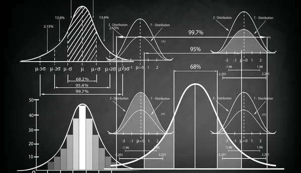
Histogram Nedir?
Histogram grafiği, verilerin özet haline getirilerek analiz edilmesine imkan tanıyan istatistiksel bir yöntemdir. Histogram ile verinin dağılımını görselleştirebilir ve bu dağılımdaki simetriyi, çarpıklığı, uç değerleri analiz edebiliriz.
Histogram Grafiği Neden Önemlidir?
Veriyi özet haline getirmek analiz, görselleştirme ve sunum süreçlerinde önemli bir adımdır. Histogramlar, verinin dağılımını sade ve anlaşılır bir şekilde göstererek, veri analizini kolaylaştırır ve verideki genel desenleri hızla anlamamıza yardımcı olur.
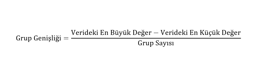
Grup Genişliği Nedir?
Group width is the measure that represents the length of the intervals in the histogram when the data are divided into certain intervals. As the group width increases, the data is shown in a less detailed and more summarized form. For a histogram graph to be meaningful, it is important to choose the correct group width.
Grup Genişliği Formülü Nedir?
We can use the formula below to find the group width. When determining the group width, the number of groups should be decided. Number of Groups is the number of columns in the histogram. It is important to choose correctly how many groups to divide the data into. We can determine the number of groups by ourselves or by statistical methods. The most important methods used in determining the number of groups are Sturges Rule, Scott Rule and Freedman-Diaconis Rule.
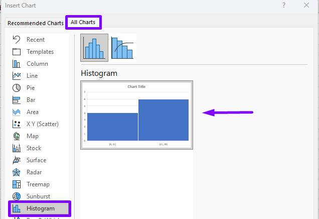
Excelde Histogram Grafiği Nasıl Yapılır?
o create a histogram chart in Excel, data must first be selected. We can create a histogram chart in Excel by going to the Insert tab and selecting the histogram chart from the Charts section.
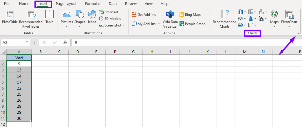
Using the window below, we can easily add charts other than histograms to our work.
Pythonda Histogram Grafiği Nasıl Yapılır?
The matplotlib.pyplot library can be used to create a histogram plot in Python. With this library we can easily convert our data into a histogram plot. We can create a histogram graph in python with the following python code. In the variable named data, we write the values we want to create the graph. The bins parameter allows us to specify the number of groups in the histogram graph.
import matplotlib.pyplot as plt veri = [9, 13, 14, 17, 22, 25, 26, 28, 29, 30]plt.hist(veri, bins = 3) plt.show()
Histogram Grafiği Nasıl Yorumlanır?
With the histogram graph, it can be determined in which range the data is concentrated. It can be examined whether this situation is normal in the ranges where the data is too much or too little. In addition, new strategies can be created by analyzing the histogram graph. For example, if the frequency of customer visits is high between 10-11 am, we can increase the number of employees in this time interval.
İstatistik ile ilgili benzer içerikleri okumak isterseniz aşağıdaki yazılarımı da inceleyebilirsiniz.
1. Standart Sapma Nedir?
2. Korelasyon Nedir?
3. Öneri Sistemi Nedir?
4. Veri Bilimi Öğrenmek İçin En İyi Kaynaklar
1. Standart Sapma Nedir?
2. Korelasyon Nedir?
3. Öneri Sistemi Nedir?
4. Veri Bilimi Öğrenmek İçin En İyi Kaynaklar
Yeni çalışmalardan ve benzer içeriklerden haberdar olmak isterseniz beni aşağıdaki hesaplardan takip edebilirsiniz.
Linkedin: www.linkedin.com/in/mustafabayhan/
Medium: medium.com/@bayhanmustafa
Histogram ve İstatistik ile İlgili Etiketler
Histogram | Histogram Nedir? | Histogram Grafiği | Excel Histogram | Python Histogram
About author

Mustafa Bayhan
Hi, I'm Mustafa Bayhan. I am an Industrial engineer who works in data-related fields such as data analysis, data visualization, reporting and financial analysis. I am working on the analysis and management of data. My dominance over data allows me to develop projects in different sectors. I like to constantly improve myself and share what I have learned. It always makes me happy to meet new ideas and put these ideas into practice. You can visit my about me page for detailed information about me.
You may also like


0 Comments
Leave a Reply
Recent Posts

Kumru AI İncelemesi: Güçlü Yönleri, Zayıf Yönleri ve Kullanım Deneyimi

Large Language Models (LLMs): RAG, Context Engineering, and AI Agents

Model Selection in Data Analysis: What are AIC and BIC?

Types and Meanings of Histograms Used in Data Analysis

Can Correlation Be Used to Infer Causality?
Histogram Nedir, Histogram Grafiği Nasıl Yapılır?